CASE STUDY / BRAND + PRINT + VEHICLE
Color Works Painting.
THE CLIENT
A Boston-area painting company with strong word-of-mouth but no visual identity to match the quality of the work — every touchpoint looked like it came from a different business.
THE PROBLEM
Estimates, yard signs, shirts and the van each carried a different logo treatment. Prospects couldn’t connect the crew they saw on site with the company that quoted them.
THE BUILD
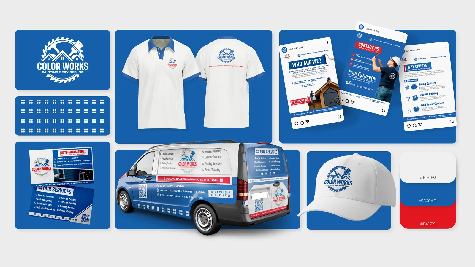
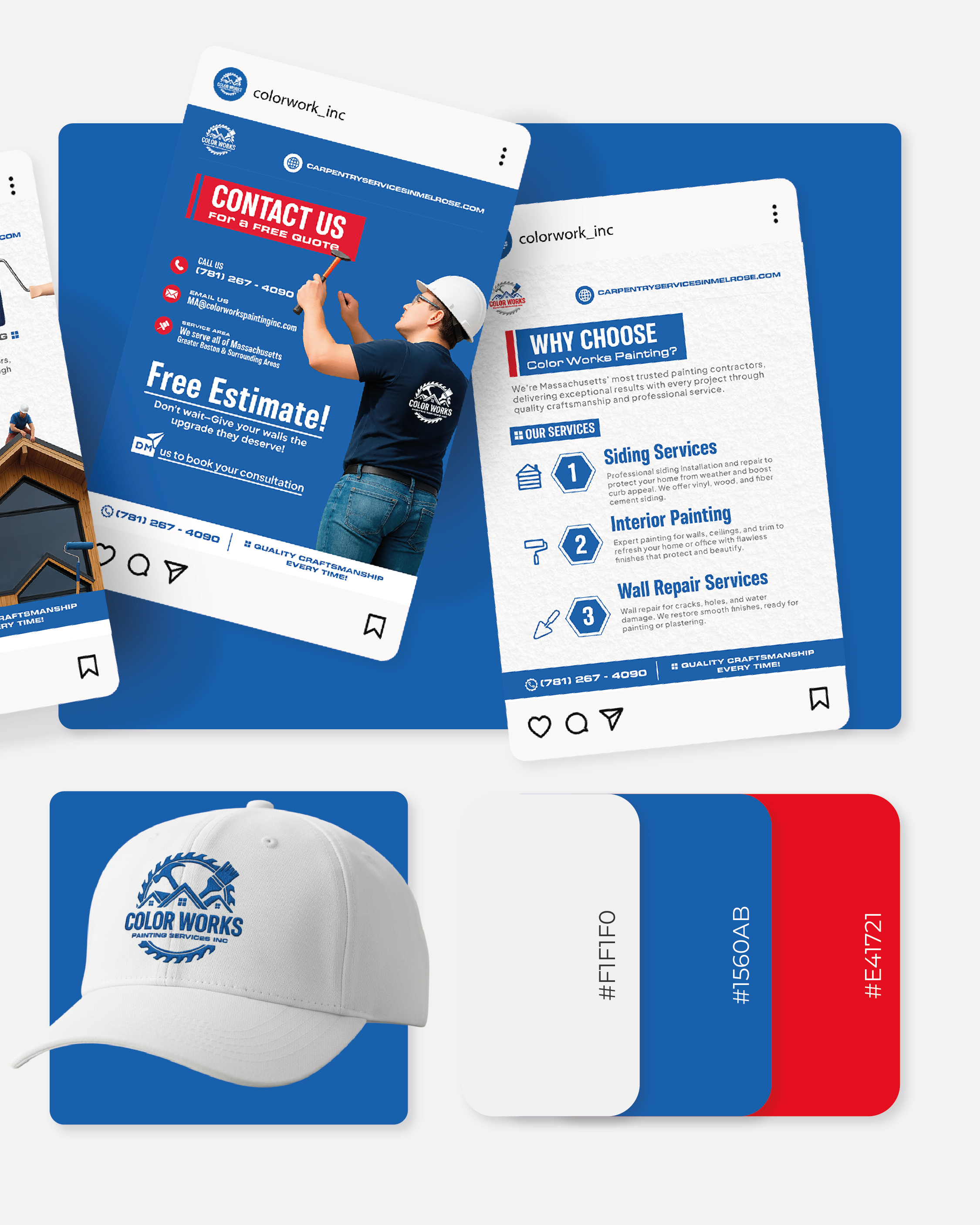
One identity system rolled across everything: logo suite, service flyers, social templates, apparel, caps and a full vehicle wrap — so every job site now advertises the next one.
DELIVERABLES
LOGO SYSTEMBUSINESS CARDSSERVICE FLYERSSOCIAL TEMPLATESVEHICLE WRAPAPPAREL + CAPSYARD SIGNS
““People started mentioning the van before they mentioned the price. The whole company finally looks like one company.””
WANT THE SAME FOR YOUR BUSINESS?
Tell us what you're building — a free 20-minute call and a fixed quote, from our studios in Revere and Salem, MA.
MORE WORK