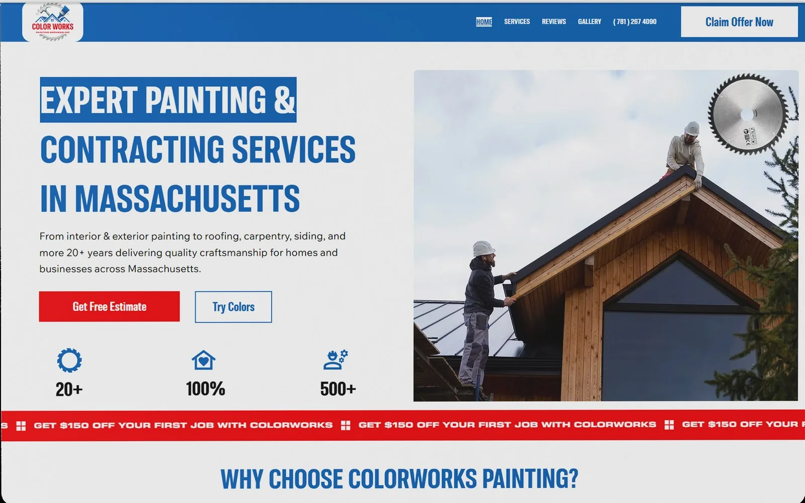
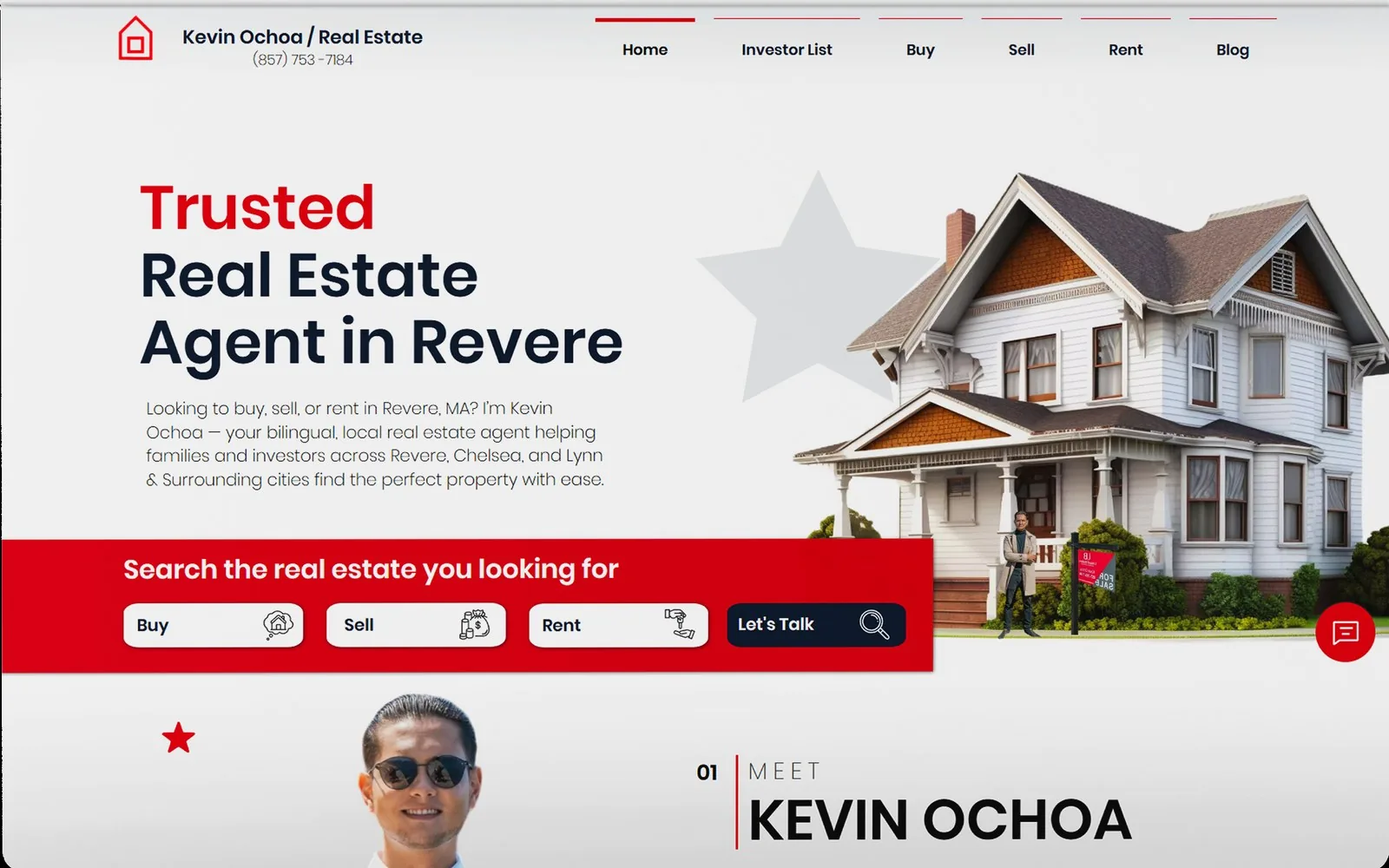
A brand isn't a logo — it's what people recognise in three seconds
Why the van, the shirt, the invoice and the website matter more than the mark itself — and what a real identity system includes.
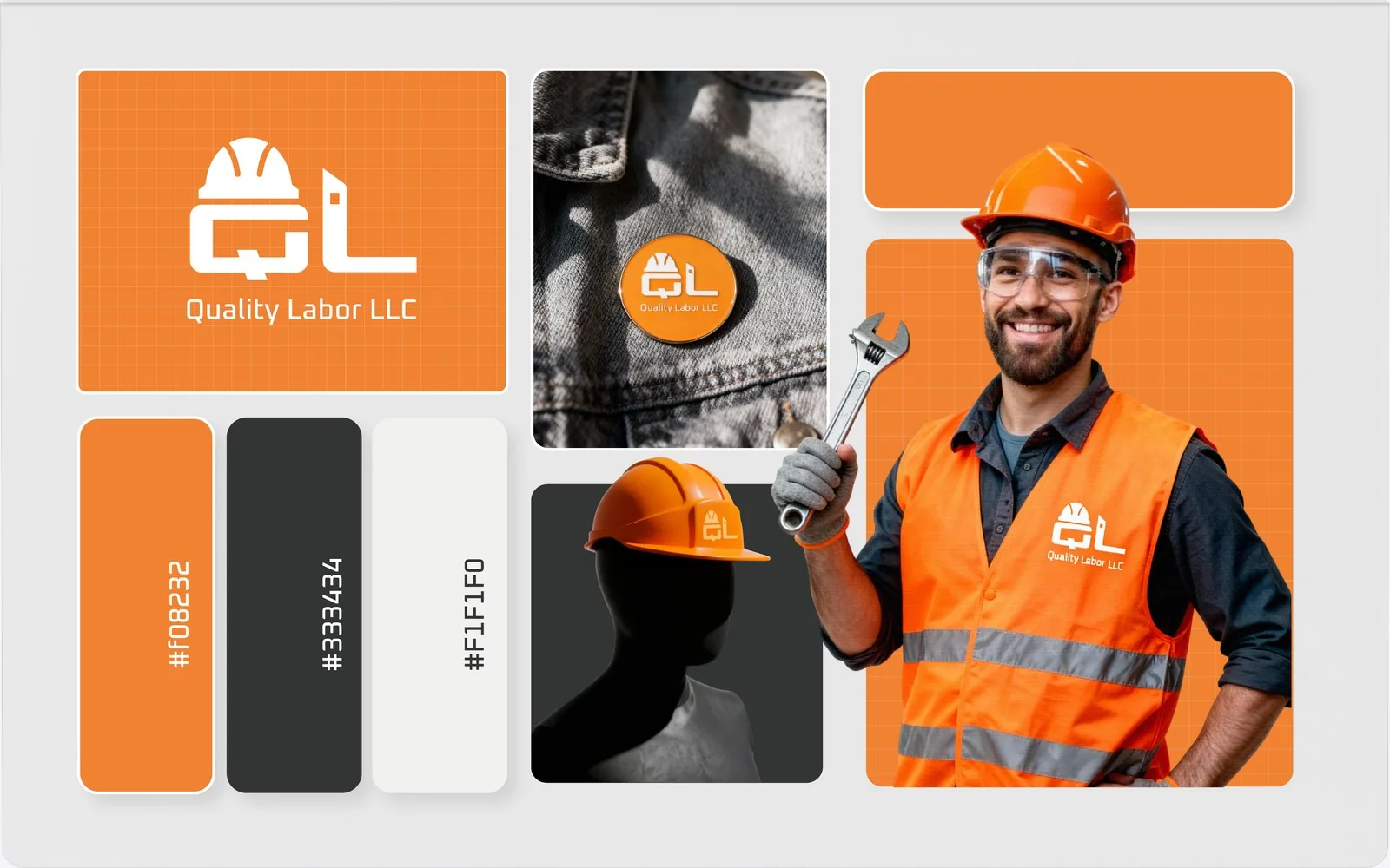
Most owners think they need a logo. What they actually need is for a customer to see the van on Monday, the flyer on Wednesday and the website on Friday and know all three are the same company.
The three-second test
Stand across the street from your own van. Would somebody who met you last month recognise it before reading the name? That is the whole job. Recognition comes from repetition of a few consistent things: one or two colours, one typeface, one shape language, used everywhere without exception.
What an identity system actually contains
- The logo, in the versions real life needs: horizontal, stacked, one colour, tiny.
- Colours with exact values, so the printer and the web developer produce the same red.
- Typography, usually two faces, with rules for headings and body.
- Applied templates: business card, flyer, social post, vehicle, shirt, invoice.
That last group is where brands are won or lost. A logo file sitting in a folder changes nothing; a wrapped van parked at every job site advertises the next one.
The cheapest branding mistake to avoid
Do not let each vendor redraw you. The sign shop, the shirt printer and the web developer will each "improve" the logo slightly unless they are handed the same files and the same rules. Six months later nothing matches and the recognition you paid for is gone.
One system, applied everywhere, is worth more than a beautiful mark used inconsistently.